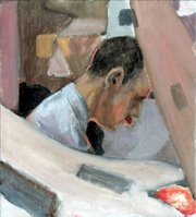
Since we've touched on the subject of black oil paint in the comments on the last post, I thought this was a good opportunity to side-step into these little paintings.

I make no great claims for them as works of art, but they were all produced using what I've always known as "the Matisse palette" - white (titanium in this case), ivory black, vermilion, and yellow ochre.

You'll see there's no blue on the palette. This means that to make green you have to use black and yellow, to make purple you have to use black and white with a bit of vermilion. To approximate blue, you can only really use black and white, which gives grey, of course.
The trick - and I admit that when I painted these I hadn't mastered it - is to influence the grey by simultaneous contrast. If you surround the grey with orange, you'll make the grey take on a bluish cast. Similarly, the purple can be made more purple by putting it next to yellow.

I've no idea whether Matisse ever actually used this palette. If he did, I guess he'd have used the colours in rather discrete flat areas. But I found it interesting to use them for more modelled forms, like Torquil's head in the picture above.
The peculiar orange rim round his head is due to the orange lamp he was sitting in front of. All of these were done inside an environment constructed from torn and draped newspaper, lit by coloured lamps. So they're not abstracts in the strict sense. Felt you should know that.


4 comments:
Very interesting.
My art degree was in graphic design. (Liverpool, before computers took over the world). My original intent before teaching was to illustrate.
Although Liverpool was quite a fine art based course (I'm glad to say), with life drawing every week, I was shown virtually nothing with regard painting. So, finding colour difficult, I kind of stumbled across the idea of using alizarin, y. ochre, and ultramarine as a basis for practically everything. Adding a few extras like cadmium y., and viridian according to need.
It served me quite well a few years ago, but working with the familiarity of a limited palette does become a trap which can be hard to break out of later.
I'm surprised a graphic design course didn't involve colour theory at least.
I always wanted to be an illustrator, until I realised I didn't like drawing the same character twice.
Your palette looks perfectly serviceable, but I think I'd want to have at least cadmium red light and cadmium yellow light there as permanent fixtures.
I think my course mostly involved either waiting for the lecturers to come back from the pub, or retire altogether (whilst regaling us of the old days when they taught John Lennon).
I guess nothing changes, but I think you've given me a subject for another post.
Post a Comment